I had the make promo offers sections form our site. Usually this is an easy task but the requirement on this case was to preserve the full page width design and keep the page usable for 600px wide screens.
So let’s start with the HTML portion.
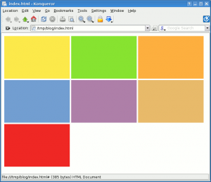
The HTML will render as this:

Let’s add a little css to get the desired effect:
  #top_offers{
    height: 190px;
    background-color: #d3d7cf;
    overflow: hidden; /* hide the excess images*/
    text-align: justify; /* or center here */
  }
  #top_offers a img{
    margin: 20px;
    border:none;
  }
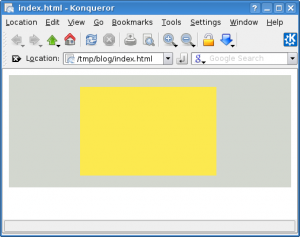
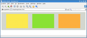
Which brings the following results:


You can play with the example here.


